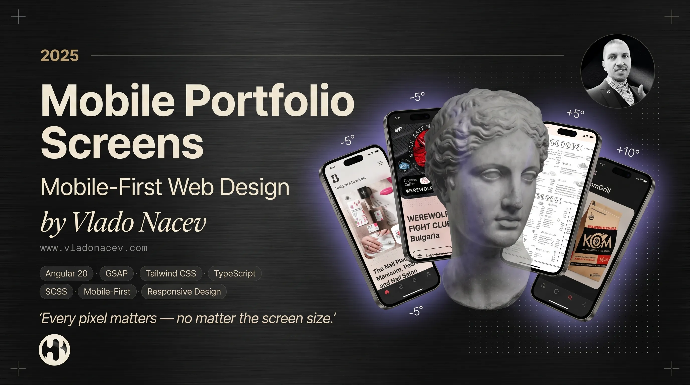

Mobile Portfolio Screens — Mobile-First Web Design by Vlado Nacev
Technologies · Angular 20 · GSAP · Tailwind CSS · TypeScript · SCSS · Material Design · Mobile-First · Responsive Design
Most visitors discover your brand on a phone first. This snapshot shows how Vlado Nacev built Madebyvladonacev as a mobile-first portfolio — where responsive web design, UI/UX craft, and front-end development work as one seamless experience.
What are Mobile Portfolio Screens?
Mobile Portfolio Screens is a behind-the-scenes look at how vladonacev.com performs on smartphones and tablets. It is not a separate mobile app — it is the same personal website portfolio, optimized from the ground up for touch, speed, and clarity on every device.
Explore the live experience at vladonacev.com or open it directly on your phone to see how design adapts in real time.
Why mobile-first design matters
When searching for a web designer or UI/UX specialist, mobile experience is no longer optional. A mobile-first portfolio proves:
🔹 The designer understands how users actually browse
🔹 Layout, typography, and navigation work on small screens
🔹 Performance and usability are built in — not added later
🔹 Touch interactions feel natural and intentional
Mobile-first principles behind this portfolio
Every section of vladonacev.com follows the same responsive logic:
🔹 Fluid layouts — from smartphones to ultrawide desktops
🔹 Adaptive typography — readable at every breakpoint
🔹 Touch-friendly navigation — clear menus, accessible CTAs
🔹 Optimized media — lazy loading, WebP images, smooth video
🔹 Consistent UI components — same design language across devices
What you see on mobile
The portfolio on mobile mirrors the full desktop experience — structured for quick discovery:
🔹 Home — scroll-based GSAP animations and first impressions
🔹 Services — clear overview of what I offer
🔹 Work — curated projects across web, brand, and print
🔹 About — design philosophy and client voices
🔹 Blog — articles on design, UX, and development
🔹 Contact — simple, accessible form with validation
👉 Browse portfolio projects
Technologies behind the scene
This mobile portfolio is powered by a modern, performance-focused stack:
🔹 Framework: Angular 20
🔹 Animations: GSAP, custom scroll-based triggers
🔹 Design Language: Material Design + Custom UI Tokens
🔹 CSS: Fully responsive layout, Tailwind CSS + SCSS modules
🔹 Typography: Responsive scale, system fonts fallback, variable weights
🔹 Performance: Lazy loading, image optimization, preloading strategies
🔹 SEO: Semantic HTML, open graph tags, meta optimization
"Built with performance and Lighthouse scores in mind."
Design services behind every mobile screen
The mobile portfolio is a live demo of the services I offer at vladonacev.com/services. Here is what you can hire me for:
1. Web Design
User-friendly, intuitive, and visually engaging websites that blend clarity with creativity.
🔹 UI/UX Design · Prototyping · Front-End Development
🔹 Web Development · Online Store & eCommerce
🔹 Icon Set Design · Mobile Banner Ads · Social Media Advertising
🔹 Google My Business Optimization
👉 Explore Web Design services
2. UI/UX Consulting
Elevating digital experiences through user research, pain point analysis, and intuitive design decisions.
🔹 Product & Experience Strategy · User Research & Insights
🔹 UX Concept Development · UI Design & Prototyping
🔹 Mobile Interface Design · App Store Optimization (ASO)
🔹 Usability Testing & QA
3. Branding & Identity
Brand identities that tell your story — from social media to packaging and advertising.
🔹 Brand Naming · Brand Identity Design · Rebranding Strategy
🔹 Logo Design · Marketing Strategy
🔹 Graphic Design for Branding · Packaging Design
👉 Explore Branding & Identity services
4. Graphic & Print Design
Print visuals that inspire, engage, and communicate your message.
🔹 Graphic Design for Print · Visual Design for Print Media
🔹 Custom Illustrations · Advertising Banners and Posters
🔹 Business Card Design · Restaurant Menu Design
🔹 Magazine and Book Cover Design · Photo Retouching and Collages
👉 Explore Graphic & Print Design
5. Front-End Development
Fast, scalable digital solutions built for performance and long-term growth.
🔹 Custom Website Development · React Web Apps · Angular Web Apps
🔹 Single Page Applications (SPA) · Server-Side Rendering (SSR)
🔹 Web Speed Optimization · Responsive & Mobile-First Design
🔹 Website Maintenance & Support
Why work with a designer who builds mobile-first?
When design and development live in one workflow, mobile experience is not an afterthought — it is the foundation.
🔹 One creative partner — from wireframes to live, responsive websites
🔹 Real portfolio proof — the site you browse is the work itself
🔹 SEO-ready delivery — semantic structure, fast load, bilingual support
🔹 End-to-end services — web, UI/UX, branding, print, and development
Get started
👉 View all services: vladonacev.com/services
👉 See my work: vladonacev.com/work
👉 Get in touch: vladonacev.com/contact
Madebyvladonacev — Complete brand experiences. From pixels to print. Designing logos, web interfaces, UI products, menus, posters, and more. Always thoughtful, strategic, and visually compelling.
📲 Follow the creative journey:
· Dribbble
· Behance
· Contra
· X (Twitter)
Related Work
Explore projects that share the spirit and approach of this article.

RM Icons Set (900+ icons and symbols)
Browse · Web
Software · Illustrator · IconMoon App.
Technologies · Icons Set · 24px/24dp Grid System · Icon Design · Font Icons.

Lazar Angelov — Fitness Academy
Browse · Web
Software · Figma · Photoshop · Illustrator · PhpStorm.
Technologies · Web Application · Laravel · HTML5 · CSS3 · SaaS · Bootstrap · Web Design · UX/UI Design · Responsive Web Design.

LottoAZ — Buy Official Lottery Tickets Online
Browse · Web
Software · Figma · PhpStorm.
Technologies · Online Shop · Ecommerce Web Design Service · Symfony · HTML5 · CSS3 · SaaS · Bootstrap · Responsive Web Design.

LottoReviewer — TOP Lottery News and Websites
Browse · Web
Software · Figma · PhpStorm.
Technologies · Ecommerce Web Design Service · Online Shop · Blog · Symfony · HTML5 · CSS3 · SaaS · Bootstrap · Responsive Web Design.