
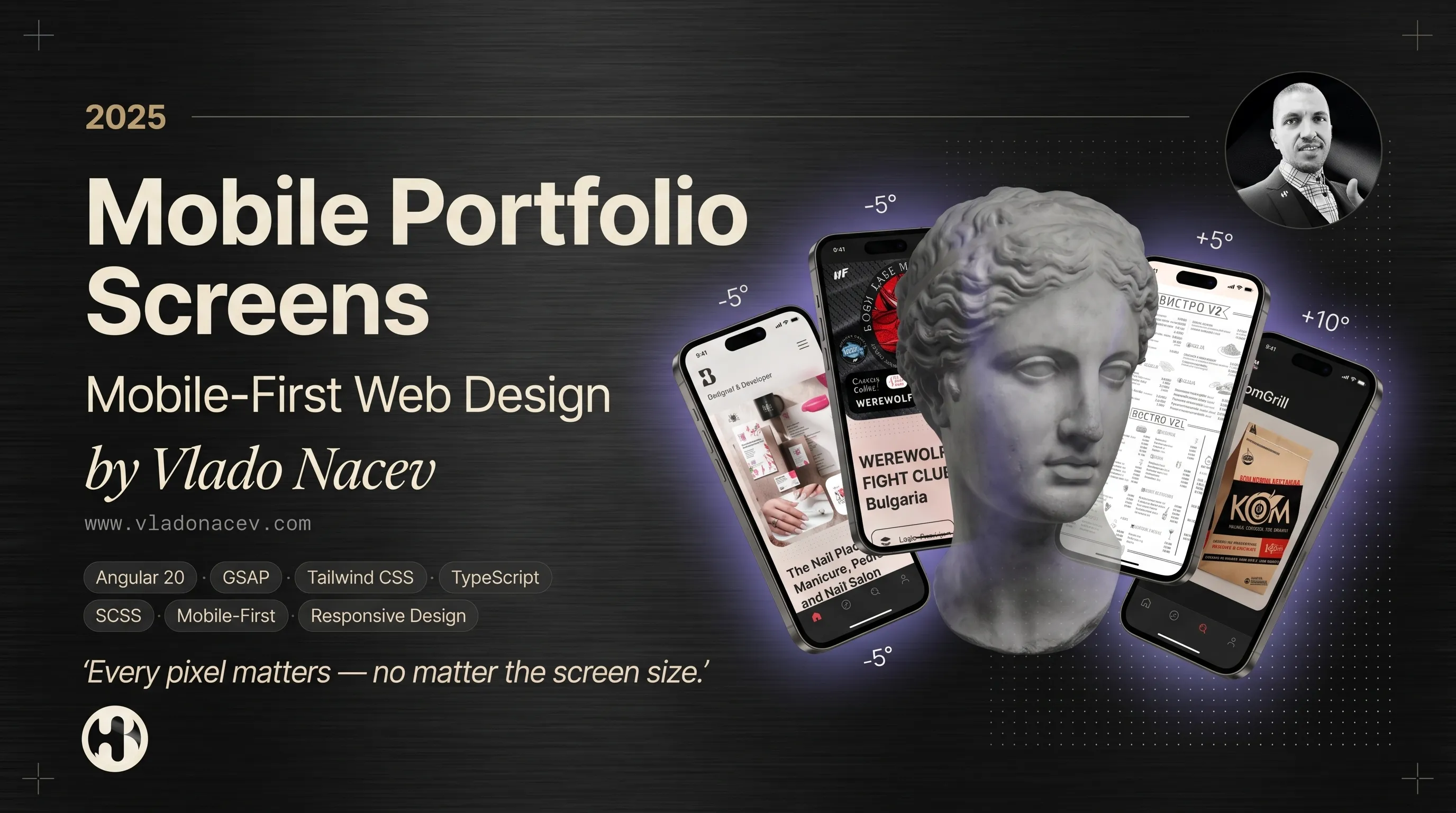

Мобилно портфолио — Mobile-First уеб дизайн от Владо Нацев
Технологии · Angular 20 · GSAP · Tailwind CSS · TypeScript · SCSS · Material Дизайн · Mobile-First · Респонсив дизайн
„Всеки пиксел има значение — независимо от размера на екрана.“
Повечето посетители откриват бранда ви първо на телефон. Този snapshot показва как Vlado Nacev изгради Madebyvladonacev като mobile-first портфолио — където responsive уеб дизайн, UI/UX майсторство и front-end разработка работят като едно цялостно преживяване.
Какво са Mobile Portfolio Screens?
Разгледайте live преживяването на vladonacev.com или го отворете директно на телефона си, за да видите как дизайнът се адаптира в реално време.
Защо mobile-first дизайнът има значение
- Дизайнерът разбира как потребителите реално сърфират
- Layout, типография и навигация работят на малки екрани
- Performance и използваемост са вградени — не добавени после
- Touch взаимодействията са естествени и обмислени
Mobile-first принципи зад това портфолио
- Fluid layouts — от смартфони до ultrawide десктопи
- Адаптивна типография — четима на всеки breakpoint
- Touch-friendly навигация — ясни менюта, достъпни CTA бутони
- Оптимизирана медия — lazy loading, WebP изображения, плавно видео
- Консистентни UI компоненти — един и същ дизайн език на всички устройства
Какво виждате на мобилно
- Home — GSAP scroll анимации и първи впечатления
- Services — ясен преглед на предлаганите услуги
- Work — подбрани проекти в уеб, бранд и печат
- About — дизайн философия и гласовете на клиентите
- Blog — статии за дизайн, UX и разработка
- Contact — проста, достъпна форма с валидация
👉 Разгледайте портфолио проекти
Технологии зад кулисите
- Фреймуърк: Angular 20
- Анимации: GSAP, custom scroll-based triggers
- Дизайн език: Material Design + Custom UI Tokens
- CSS: Напълно responsive layout, Tailwind CSS + SCSS модули
- Типография: Responsive скала, системни шрифтове fallback, променливи дебелини
- Performance: Lazy loading, оптимизация на изображения, preload стратегии
- SEO: Семантичен HTML, open graph тагове, meta оптимизация
„Изградено с мисъл за performance и Lighthouse резултати.“
Дизайн услуги зад всеки мобилен екран
1. Изработка на уебсайт
- UI/UX дизайн · Прототипиране · Front-End разработка
- Уеб разработка · Онлайн магазини и eCommerce
- Дизайн на икони · Банери за мобилни устройства · Реклама в социалните мрежи
- Оптимизация за Google My Business
👉 Разгледайте услугите за уеб дизайн
2. UI/UX дизайн
- Продуктова и UX стратегия · Потребителски проучвания и анализи
- UX концепция и развитие · UI дизайн и прототипиране
- Дизайн на мобилен интерфейс · ASO съдържание за App Store
- Тестване на използваемост и QA
3. Брандинг и идентичност
- Име на марка · Дизайн на бранд идентичност · Ребрандиране
- Дизайн на лого · Маркетинг стратегия
- Графичен дизайн за брандиране · Дизайн на опаковки
👉 Разгледайте услугите за брандинг и идентичност
4. Графичен и печатен дизайн
- Графичен дизайн за печат · Визуален дизайн за печатни медии
- Илюстрации по поръчка · Рекламни банери и плакати
- Дизайн на визитки · Менюта за заведения
- Дизайн на корици за списания и книги · Фото ретуш и колажи
👉 Разгледайте графичен и печатен дизайн
5. Уеб разработка
- Разработка на custom сайтове · React уеб приложения · Angular уеб приложения
- Single Page приложения (SPA) · Сървърно рендиране (SSR)
- Оптимизация на скоростта · Responsive и mobile-first дизайн
- Поддръжка и развитие на уебсайтове
Защо да работите с дизайнер, който изгражда mobile-first?
- Един креативен партньор — от wireframes до live, responsive уебсайтове
- Доказателство в портфолиото — сайтът, който разглеждате, е самата работа
- SEO-ready доставка — семантична структура, бързо зареждане, двуезична поддръжка
- End-to-end услуги — уеб, UI/UX, брандинг, печат и разработка
Започнете
👉 Всички услуги: vladonacev.com/services
👉 Моите проекти: vladonacev.com/work
👉 Свържете се: vladonacev.com/contact
Madebyvladonacev — цялостни бранд преживявания.
📲 Последвайте креативното пътешествие:

Свързани проекти
Разгледайте проекти, които споделят духа и подхода на тази статия.
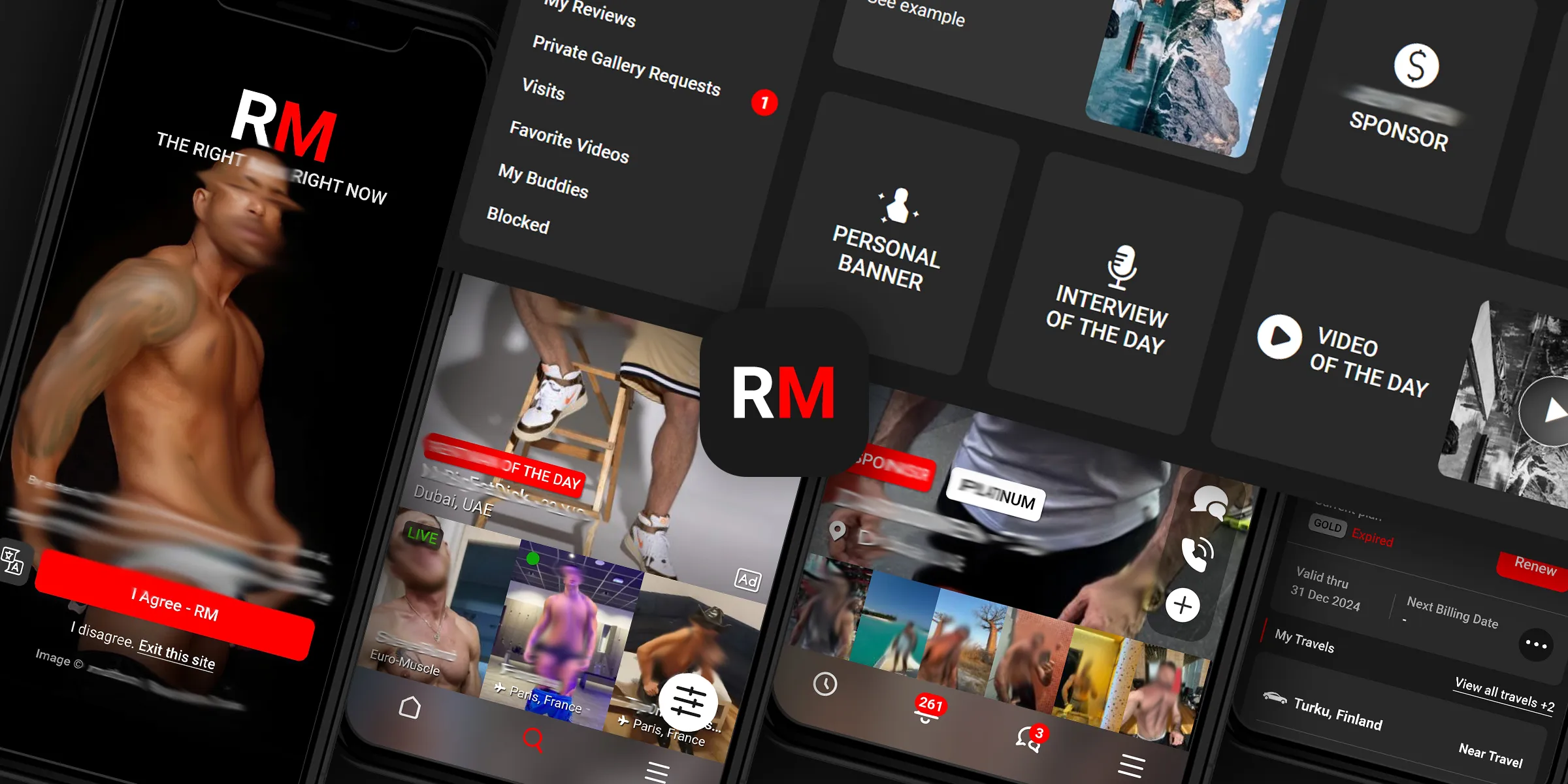
Редизайн на RM Platform
Разгледайте · Уеб дизайн
Софтуер · Figma · Photoshop · Illustrator. · Gitlab, PhpStorm.
Технологии · Уеб дизайн · UX/UI дизайн · Уеб платформа · React · Next.js · Bulma CSS Framework · HTML5 · CSS3 · SaaS · Отзивчив уеб дизайн.
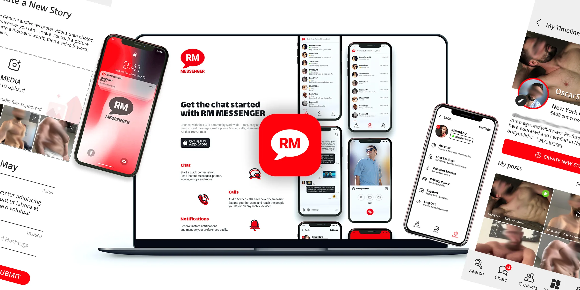
RM Landing Страница
Разгледайте · Уеб дизайн
Софтуер · Figma · Photoshop · Illustrator. · VS Code.
Технологии · Ландинг страница · HTML · CSS · SaaS · Анимация при скролиране · Уеб дизайн · UX/UI дизайн · Отзивчив уеб дизайн.
